Brand Packaging
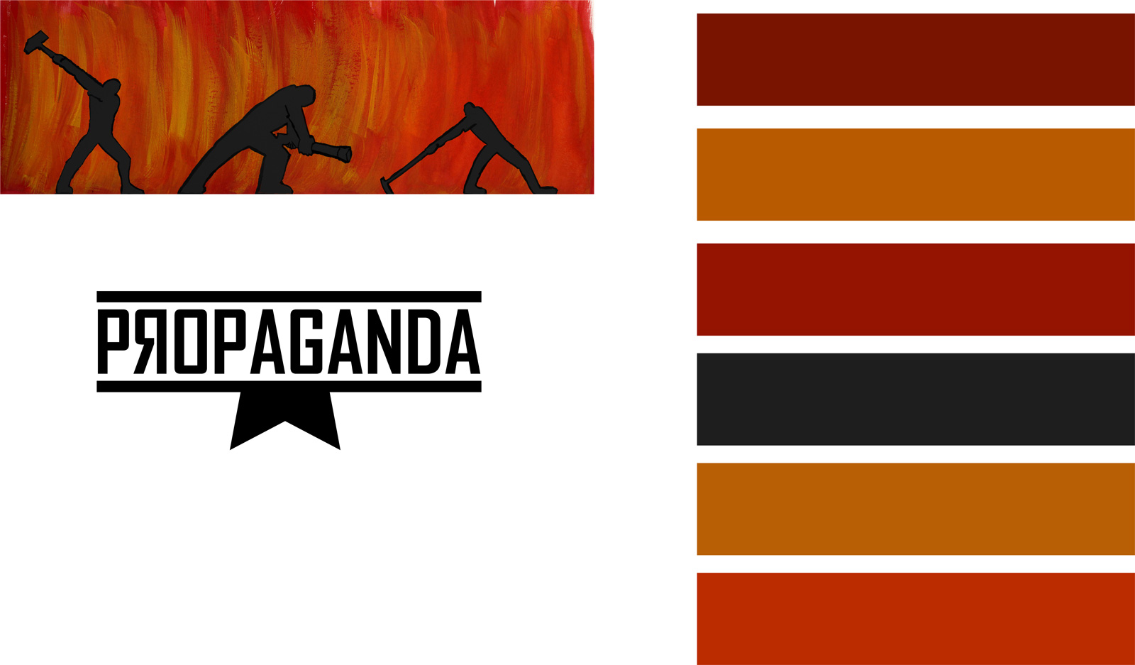
Propaganda
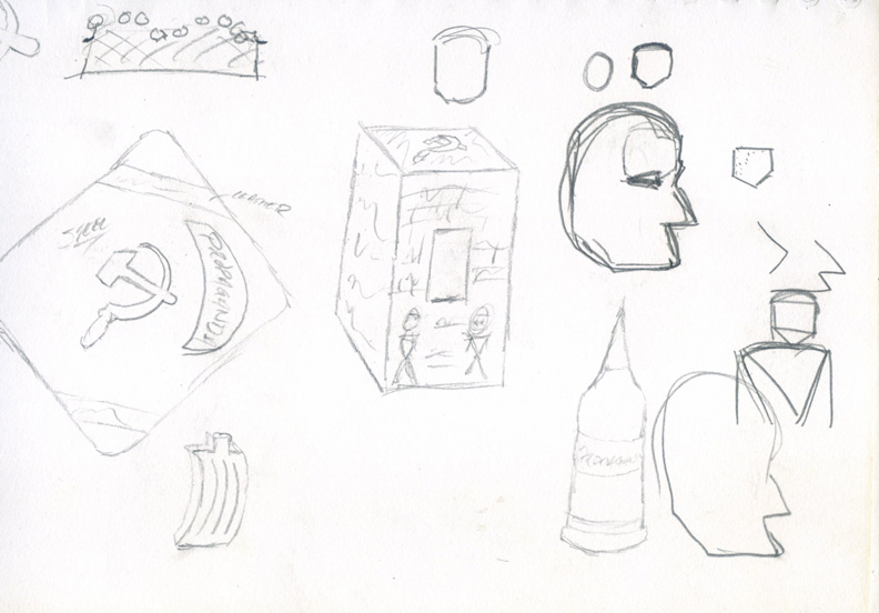
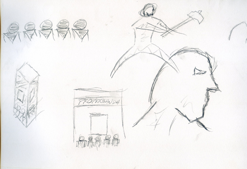
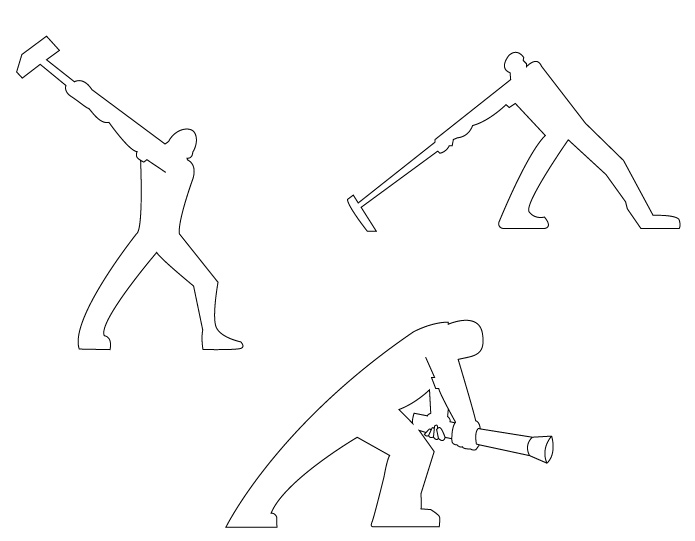
Ideation & Sketches
I began this project by sketching various ideas for both the bottle and packaging for the "Propaganda" intellectual property. My inital idea was to base it on Soviet-era propaganda posters combined with a fiery aesthetic that hearkens back to the industrial revolution within the Soviet Union.
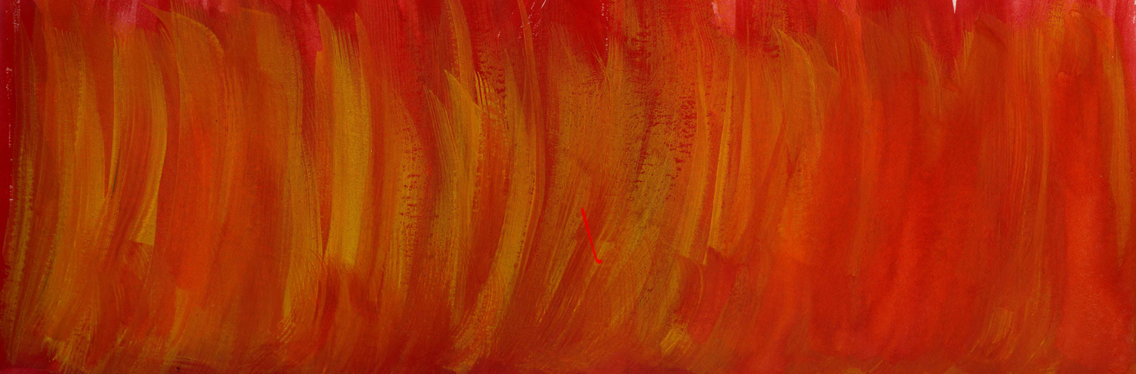
Colour Theory
After conceptualising the idea and sketching it out, I began painting the fire using oil paints, as well as painting the workers in various states of labour. This was perhaps the most frustrating aspect of the design, as I had not seriously painted in many years, and was at best out of practise. I decided to use the colours of fire as popularly imagined, and used swatches to match the paint.


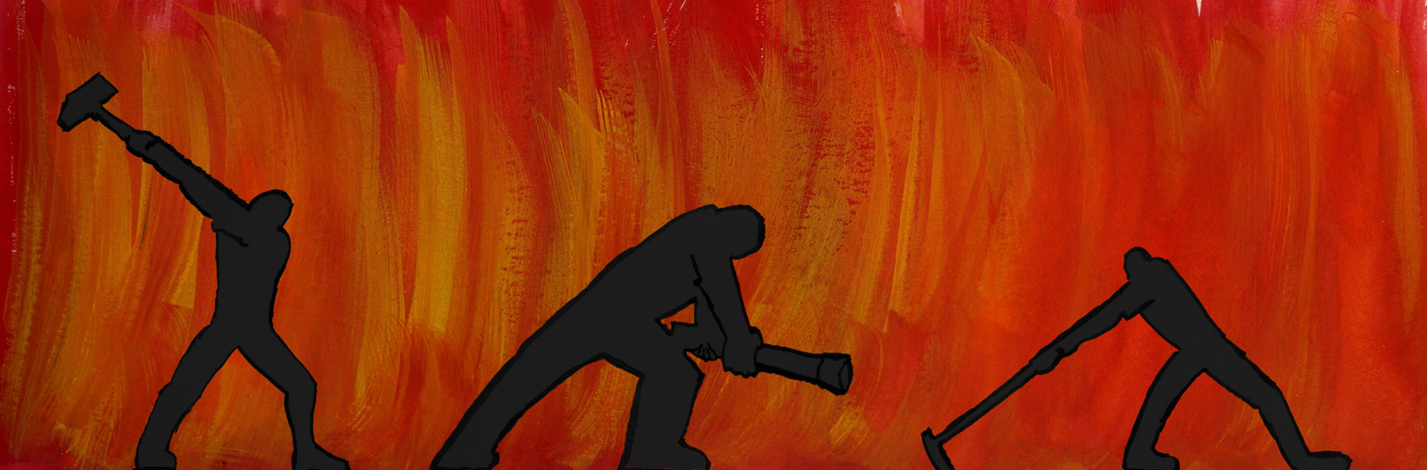
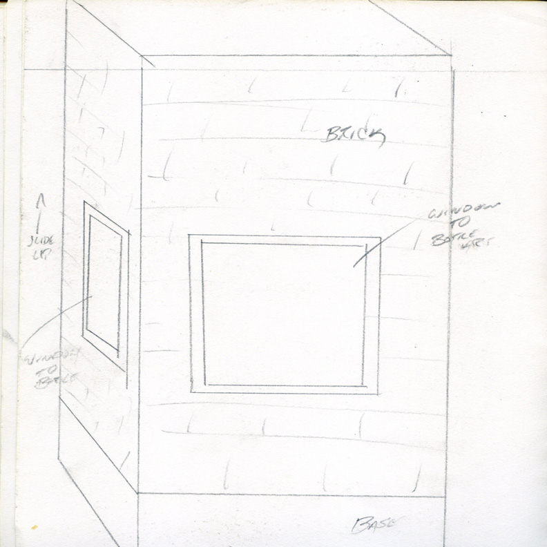
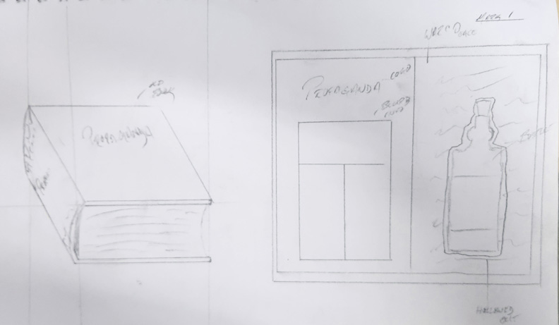
Work Progression
This series of images shows the progress I made from ideation and sketches after the first pass. Here we can see the natural flow of work, from illustrator line drawing to painting, and to get a sense of where it all comes together for the label of the bottle.
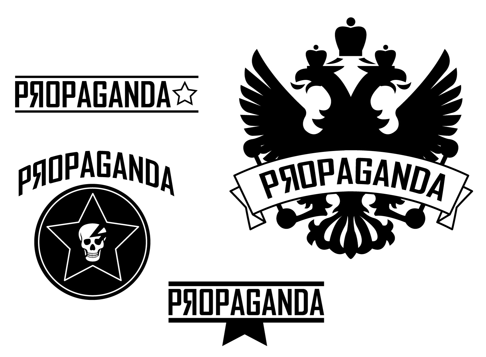
Logo Progression
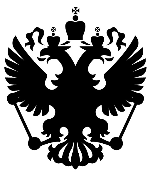
The evolution of the logo typography and graphics is on display here. I tried to keep within the boundaries of my theme and incorporate a very strong, masculine feel into the product. To that end, sharp bold lines were at the forefront of my mind, whilst a solemn strength and a hint of threat pervaded my design. I also decided to add a bit of imerialism into the work, for the purpose of patriotism and pride. I believe it added a history that perhaps was not as obvious in previous iterations.
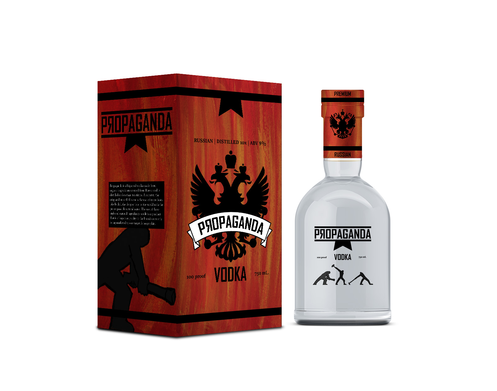
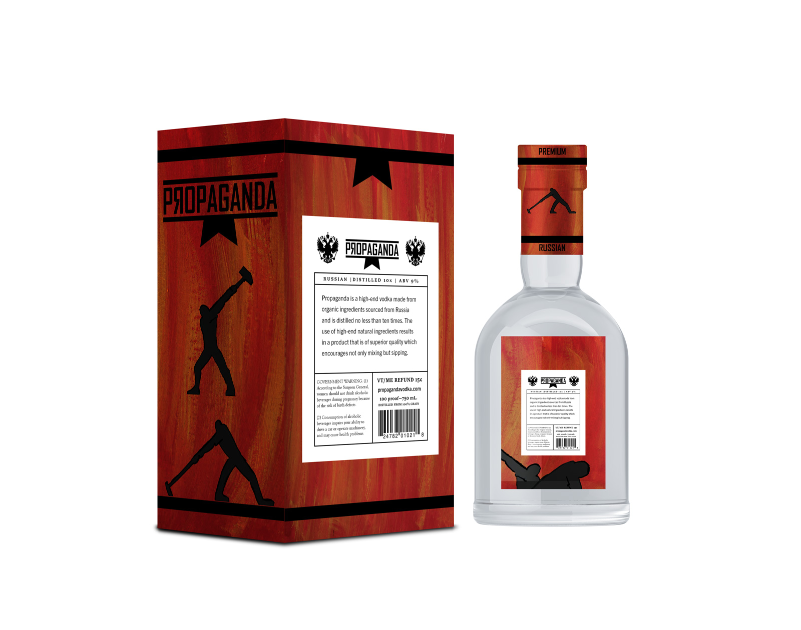
Front box and bottle
Finally we come to the finished front design. I kept the imperial eagle logo along with the fiery background which lends itself to bold, eye-catching design. On the left side, we see the muddler man as well as some basic history of the brand. I also decided to change the logo on the bottle itself, sticking with the classic propaganda but without the graphic, and to put the workers toiling away along the glass.